
indi home screen
indi is a digital banking product built for independent workers. With indi you can apply for your account in minutes, bank on the go, save for taxes, and effortlessly track expenses.
My role
I’ve been working as the Lead Experience Designer on the indi app since day one. I’ve watched our vision of sticky-notes and lo-fi mock ups iterate into a reality. With a passionate customer base, a reliable design system, and an exciting roadmap ahead, I am proud to be a leader of this product.
For this project I designed the home screen of the indi banking app, this is prime real-estate that allows customers to check their account balance and view recent activity. It is critical to ensure that users are extremely clear on what the breakdown of their funds are so there was a lot of exploration and testing. It was important to ensure the visuals fit our account model. My contributions include the account balance overview and recent activity design.
In this project you will find an abridged version of my process that focuses on:
Information Gathering
Design Exploration
User Research
The Solution

Information Gathering

To kick things off, I met with our legal and compliance team to understand any constraints upfront. They come from PNC and are the domain experts. Based on prior conversations I know they wanted to be involved from the start.

The homepage is the most prominent real-estate in the app. In an effort to help truly activate customers, I knew we wanted to leverage the home page to light the way for users in terms of how to get started.

I followed up with a collaborative exercise with the design team and our PM to brainstorm the potential opportunities on the home page, we discussed ways to inform and educate, engage, and activate our customers.

As I started to piece together a path forward I wanted to be cognizant of the fact that the UI of this screen will be the face for indi in many areas of advertising and marketing. I knew this page may appear on: the marketing website, in the app store, in our onboarding, as part of blog graphics, in help article assets, advertisements, and social posts.
Design Exploration

The main focus on this page is the customer’s account balance so I began to explore a variety of visualizations, adjusting layout, scale, labels, graph type and more.

Expanding on the previous exercise, I did a series of mid-fi mock-ups to explore pros and cons of pie graphs, a dropdown approach, a carousel approach, and so on. At this point I was doing some guerrilla usability testing, this is a very fast low cost way to get feedback. I was connecting with team members talking through these samples with people who have freelanced and can directly relate to the issues this account structure aims to solve.

Based on feedback from the first round of mid-fis I went back to the drawing board to create some more refined options to start user testing. When redesigning this round, there were a few themes I was going off of:
Only seeing the “safe to spend” portion was stressful and made it feel like tax savings portion is inaccessible.
Having tasks and tips styled as a list view was easy to glaze over, a more dynamic styling approach could help engagement.
Seeing the account number helped reinforce that this is a single account with two notional balances.
Seeing the full lists of onboarding tasks could be overwhelming so we may want to put that behind summary
User Research

With a few versions and assumptions under way, I continued to test the designs across a variety of platforms. I ran unmoderated usability sessions on usertesting.com, this allowed me to create highlight reel which was useful when communicating user feedback to compliance. I worked with a Pittsburgh based Research and Strategy group to bring in candidates for a focus group session, and I conducted a survey on survey monkey.


For our in person sessions we did a “card sorting” inspired exercise where customers built their own home page. We had different sections that served unique purposes and had them organize in priority order.

These cards included account balance, recent activity, tasks and tips, quick links to the help center and card management, relevant news, blog content, and more.

What we ended up seeing over and over was the account balance, and account set up being the top two priorities, followed by recent account activity.
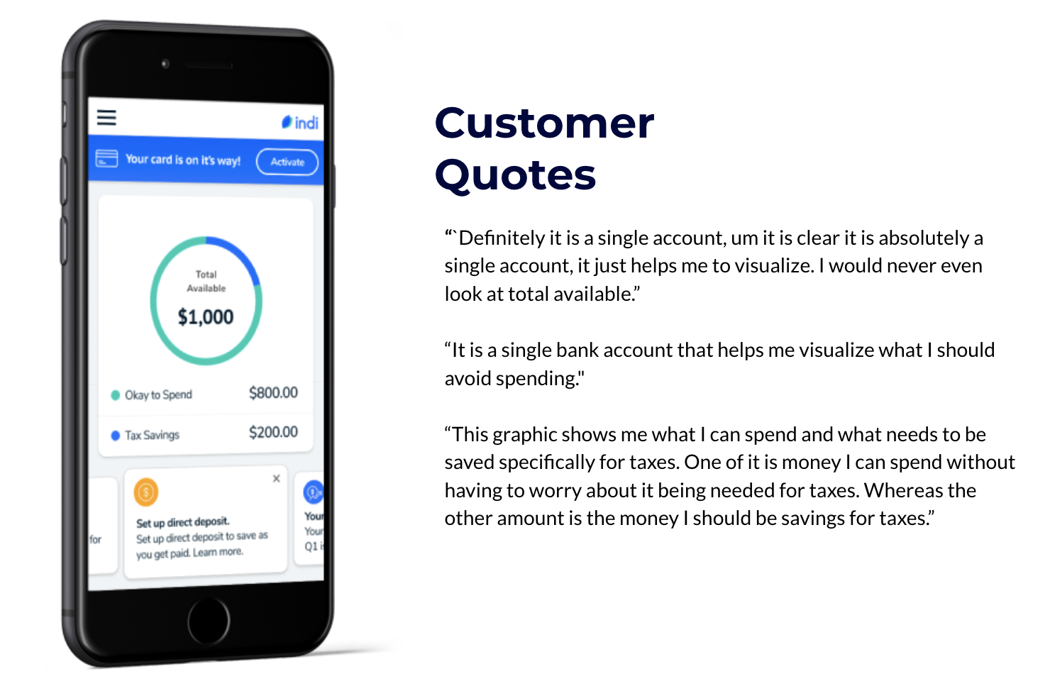
The pie graph yielded positive results where customers were very clear on what was available at a glance, and they truly understood the relationship and definition of okay to spend and tax savings.
The Solution

The final solution leaned into the patterns that came out of these sessions, we have a conditional banner at the top to help customers convert their finances to this account, once the user completes those tasks or chooses to remove that banner, account balance and recent activity become the first two items.


Want to learn more about indi?
How indi works
Smart banking for independent workers.
I aim to design an experience that enables independent workers to thrive in their unique form of business. Because being your own boss comes with a lot of perks, but tracking your finances isn’t one of them. And because money doesn’t grow on trees—especially when you’re running your own show. I value flexibility, respect differences, and want to help our users celebrate each and every financial win.
I focus on customer satisfaction by enriching and improving the indi experience through design thinking. Throughout my process I utilize perspectives from user surveys, analytics, and a variety of team members including our PM, customer support team, legal and compliance and of course other designers. I work in Figma with a library of components and build out the app flows alongside our developers. Additionally, I support marketing with creative assets for our social and email campaigns.
Apply for your account.
Users will create a username and password to get started. We will then collect a set of information to help verify their identity when applying for the bank account. This includes the user’s name, address, social security number, date of birth, and driver’s license information.
Set up your tax savings goal.
Once approved for the account, we ask the user to set up their Tax Savings Goal. We’ll gather a few bits of information about the user’s income and use it to calculate the estimated amount they should save to cover federal and state taxes. As direct deposits comes in, indi will designate a percent of each pay to Tax Savings. This helps the user be prepared come tax time by putting away a little at a time, just like if they had a W2.
Track income and expenses to maximize deductions.
When users make purchases with their indi Visa debit card, we auto-categorize deductible expenses in real time. Additional features like receipt capture, and remote check deposit make it easy to stay organized on the go. No more piles of receipts in boxes, or trips to the bank to deposit your checks.