indi logo
Turning over a leaf is a chance to start anew. Freelancers have the benefit of starting fresh each day. The leaf is symbolic of the new beginnings that come with self employment. Just as leaves inject food to the plant to provide strength and stability, indi will enable users to prosper and grow.


Research Phase
Before executing on design, I studied our target users, and realigned the business on our principles and values. This research ensured my logo would appeal to the proper audience, represent the company and brand appropriately, and pop among the competition.
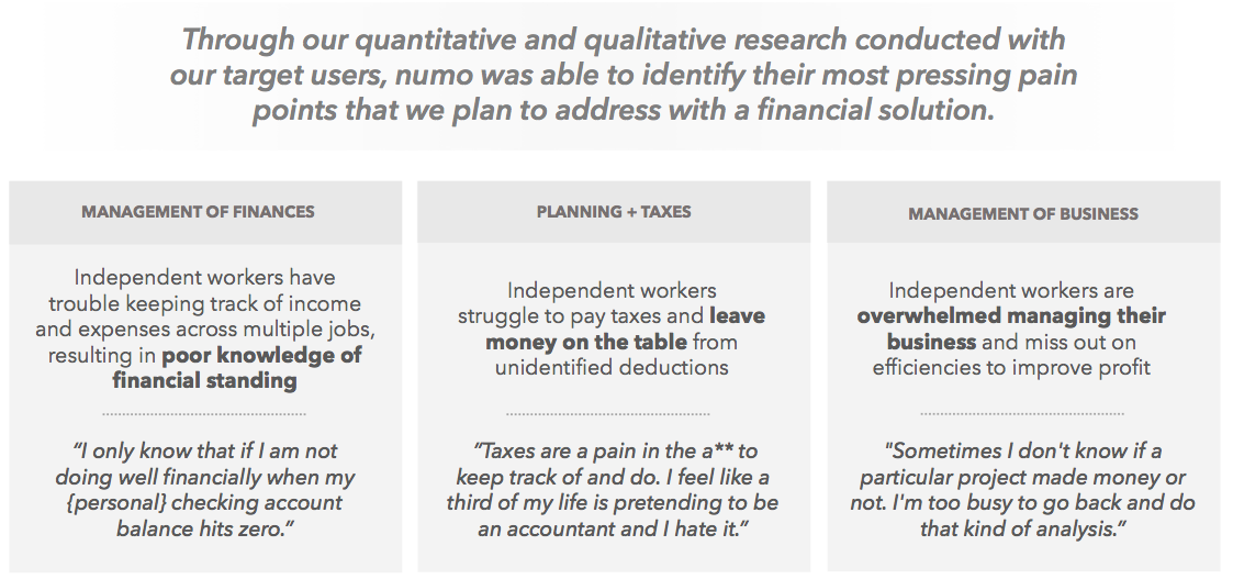
I began the process by reflecting on the pain points our product is solving for.

I studied the segmentation and personas we would be targeting.

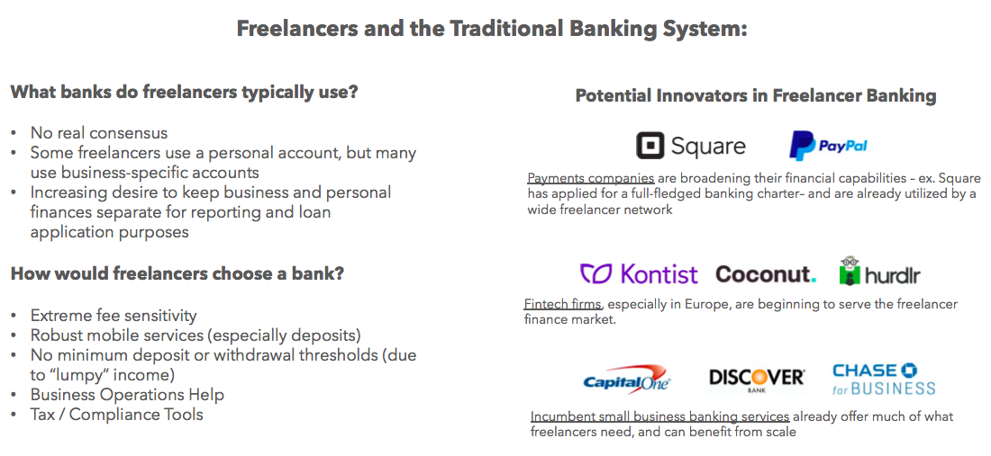
Firmed up supporting technologies to vet cobranding needs.
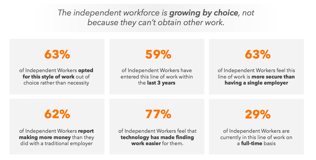
Evaluated market metrics to get a pulse on our user’s lifestyle.

Looked at where our product may sit among the bigger picture.
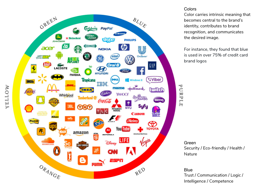
Considered the balance of our brand as a bank versus marketplace.
Planning and Research Phase
Naming sessions: Held weekly group sessions to brainstorm names with the team.
Stayed in contact with compliance: The vetting process was lengthy and rather difficult to pass. Knowing a handful of team favorites were already nixed, we pushed larger lists of options through to compliance to get approval faster.
Aligned on the goals of the logo: Simple, memorable, appropriate.
Our logo should clearly represent the essence of indi, be attractive, and provide a positive feel for what we stand for.
Studied 2018/2019 logo trends which included: Geometric Shapes, Bright Colors / Neon, Creative Typography, Field Line, Layering, Responsive Logos, Architectural Inspiration, Simplification, Text-box

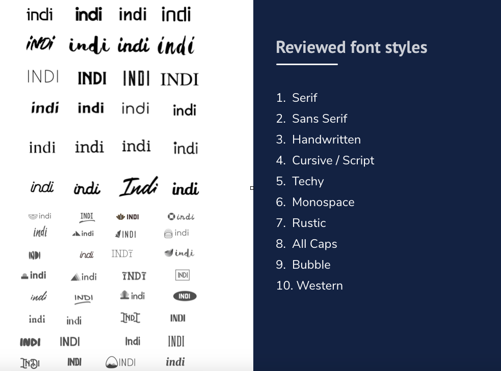


Narrowing down the concepts:
Socialized options internally for feedback with both designers and non-designers
Conducted surveys in survey monkey, looking at each option against competitors and then a survey comparing each logo to one another
Determined top logo pick and fine-tuned application of color, text-kerning, scale of pictorial mark to word mark


Finalizing the Wordmark


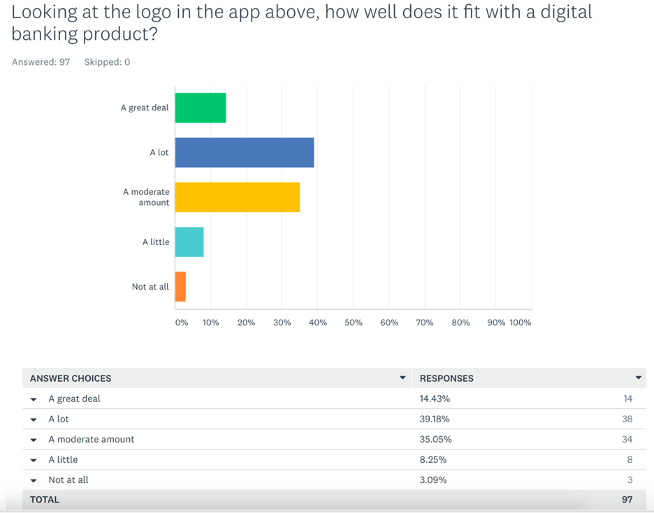
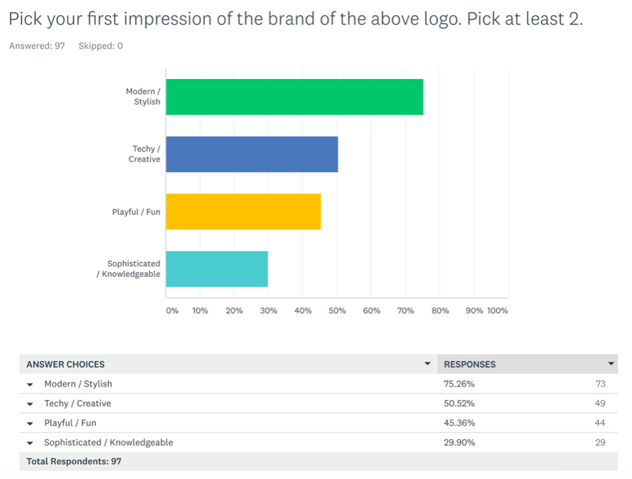
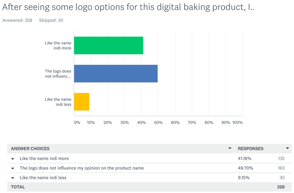
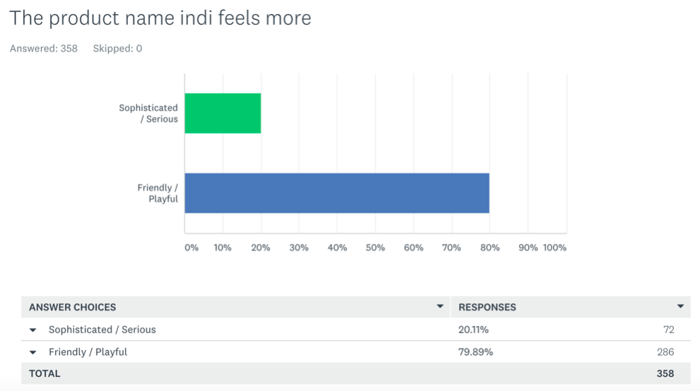
Surveyed hundreds of potential customers to validate the logo.