indi web application
Apply for indi on the web
indi is a digital banking mobile app available on iOS and Android. I was tasked with designing a web experience for our onboarding so customers can sign up and apply online before downloading the mobile app.
Outlined benefits and goals of offering our bank application online:
Broadens our ability to capture more customers
Is a win for accessibility
Creates a means for indi to integrate with business partners by enabling them to wrap our sign up in their mobile app
Paves the way for web paradigms and patterns as we look to develop the full product offering online
Table-stakes among other digital and neo-banks
My approach:
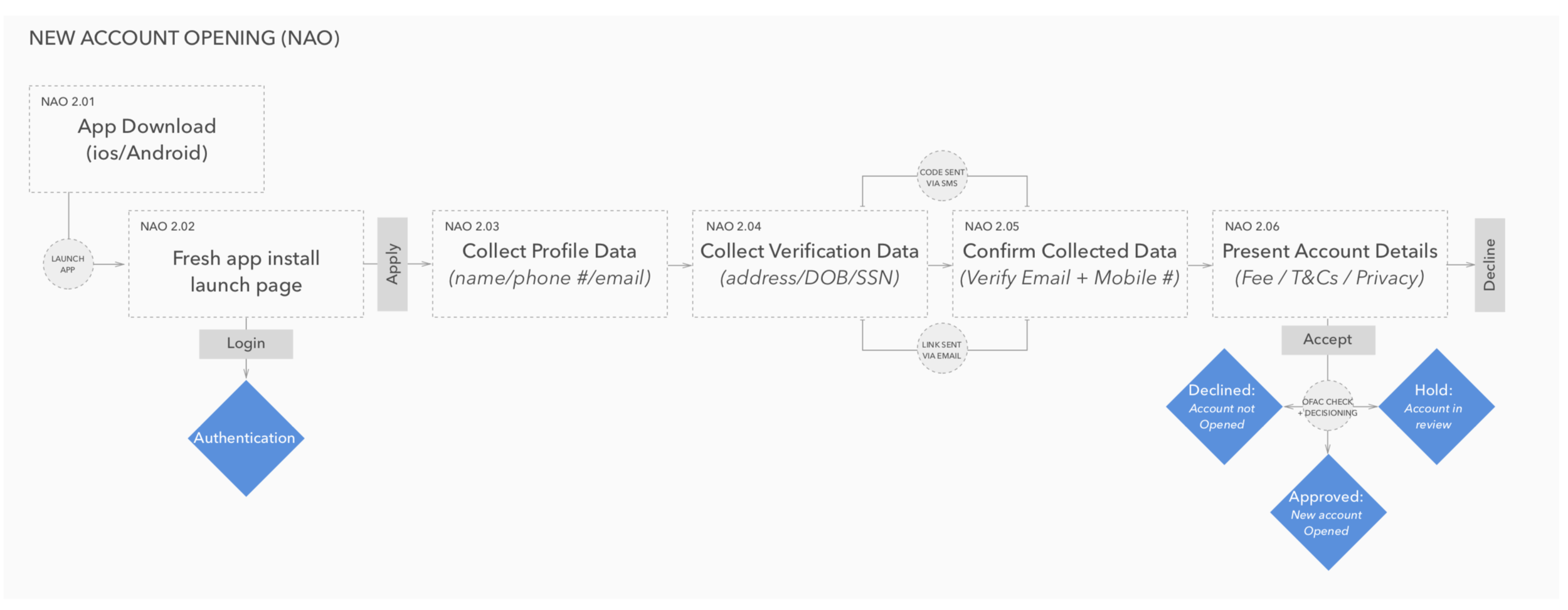
Mapped out potential entry and exit points to envision how a customer may experience the full journey. This helped me uncover any contextual content to include to seamlessly guide the user along from one product/flow to the next.
Analyzed data in MixPanel from the existing mobile experience to help inform what was working well and what needed adjusting. I wanted to understand where our users were dropping off, spending the most time, or entering invalid data.
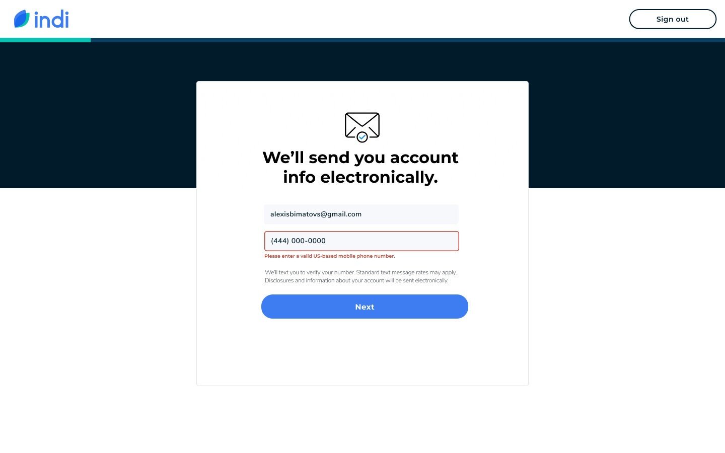
Sought out ways to remove friction and help the user coast through the application (added auto address complete to speed up the form completion process),
Identified UX differences between web and mobile, pinpointing native mobile UI to identify where I would need to optimize for ease of use on the web (modals versus bottom sheets).
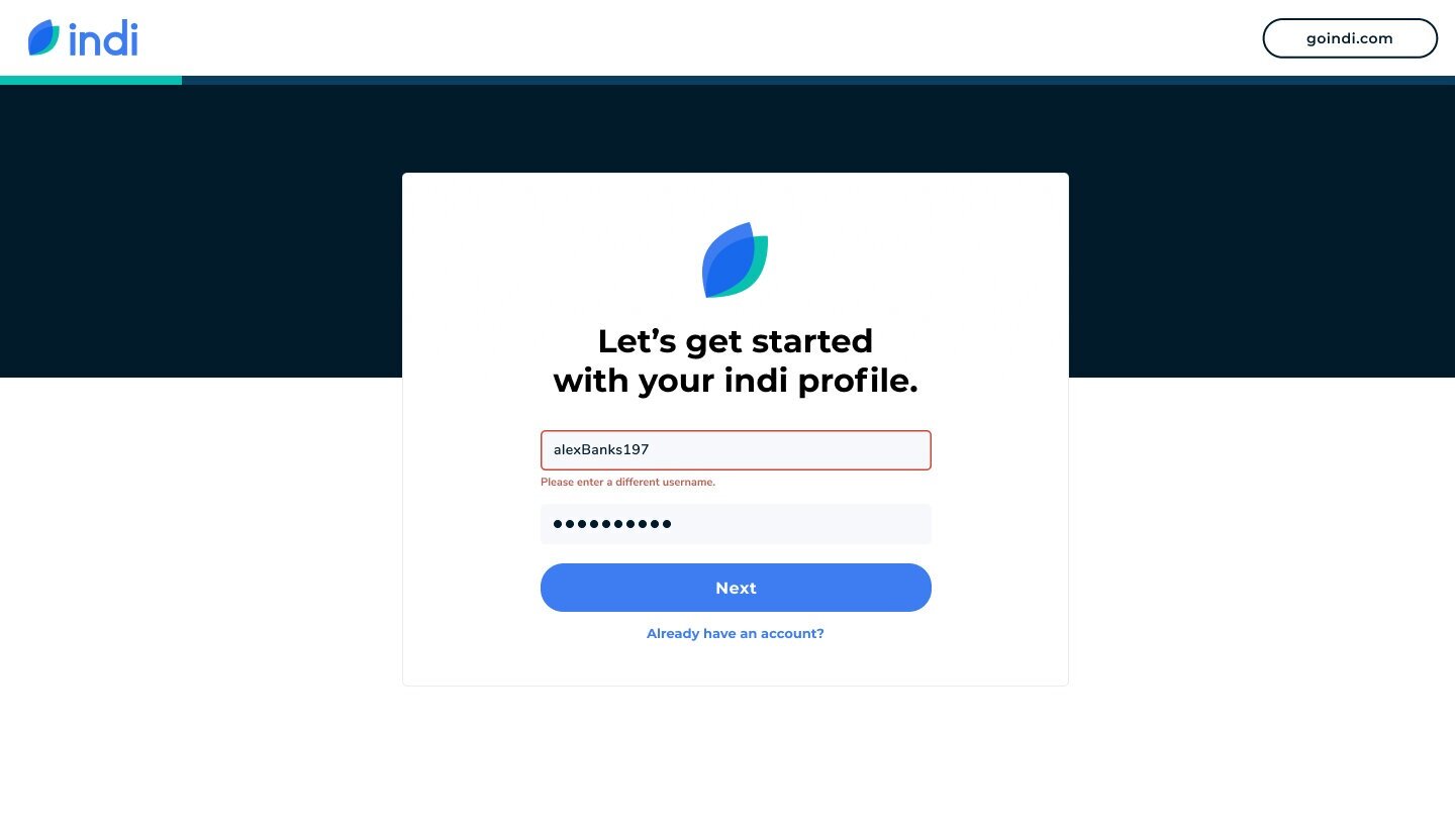
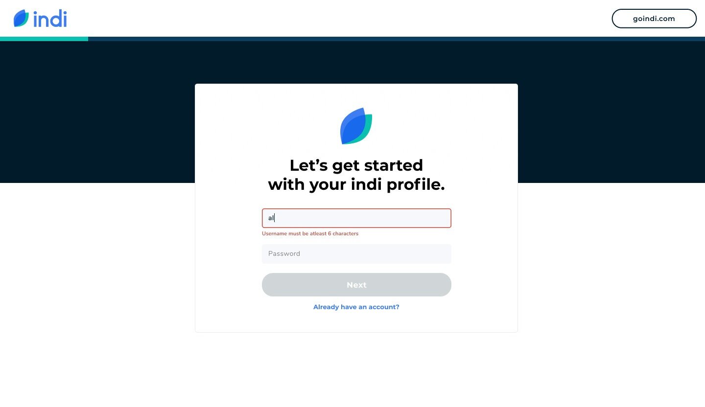
Kept a single form per a line so the grid is clean and doesn’t force the user to reorient as their eyes move down the page. A study by CXL Institute found participants were able to complete a single-column form an average of 15.4 seconds faster than a multi-column form.
I leveraged page titles to highlight how we use customer’s information to gain trust.
Beneath the input fields I explain the need for certain information to be transparent around usage of their personal information. This is to walk users through the process as if they were applying with a banker in person in an effort to humanize the process.
Worked alongside our Legal team at PNC Bank to get the designs approved by Compliance.
Flushed out the acceptance criteria for each story under this epic in JIRA to provide an appropriate level of detail for implementation. I was working closely with our engineers throughout the process but this documentation is useful for grooming and QA.
Iterated on a variety of design treatments once the flow was mapped out to provide high quality visuals that engage and delight.
Outcome:
A component library has been built out in Figma to help us build web interfaces faster in the future.
A prototype that is a key material to secure and set expectations with business partners is being utilized.
Developers have a clear plan with shared goals for what to implement.
Because I iterated based on our historical benchmarks, we are likely to see improved conversion results overtime (adjusted a flow that resulted in a 4% drop off).
We will be up to par with the competition in this regard.

Design considerations
Point of entry.
Users can enter the web app flow through paid ads, the indi website, or business partners. Depending on how users arrive, we show a conditional landing page prior to the start of the application and post decisioning.
Priming the user.
The flow begins by priming the user with what they’ll need to complete their bank application. This allows them to be prepared so once they’re engaged there is no friction or disruption to the workflow.
Partner data.
If the user applies through one of indi’s business partners, we’ll have a number of data points pre-filled. While this can expedite the flow, we allow the user to review and modify any information passed to us.
De-duplication.
Based on data from our customer support team, we see a lot of users creating more than one account. To prevent this, I added two methods of deduplication to encourage downloading and signing into the app.
New progress bar.
As part of the web experience, I added a material inspired progress bar. This gives the user the sentiment of where they are without bogging them down with semantics of how the flow is broken down.
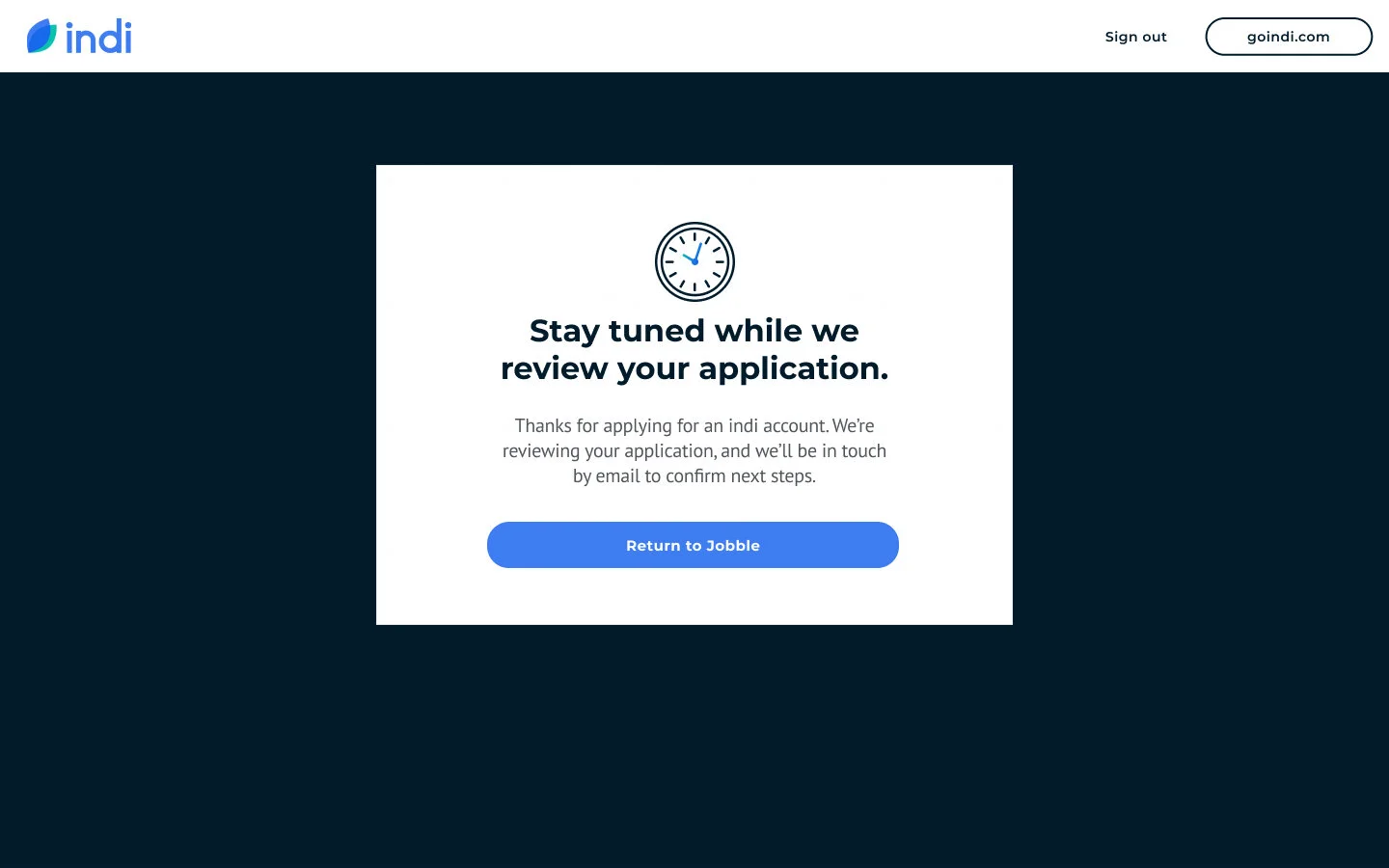
Post application communication.
If a user’s application is approved or pending, we will need to re-engage them. An email is sent to the user providing them with links to download the mobile app. Once in the app they can complete onboarding.


Looking ahead
The online application is a pre-requisite to offering the full mobile app experience on the web. For added context and a bit of inspiration, I briefly put together a concept of how our service may look down the road. I wanted to ensure the flow was scaleable and supported our future visions.

Color and card exploration
Below are a few samples from my color exploration. I wanted to frame the center card with a colored block in the background. This treatment held the space more comfortably and balanced the page well. It is a way to elevate the indi brand, and ties everything together to provide a more polished feel. By ultimately applying navy, it creates a lot of contrast between the background and the card, helping the center content pop and be the center of attention.

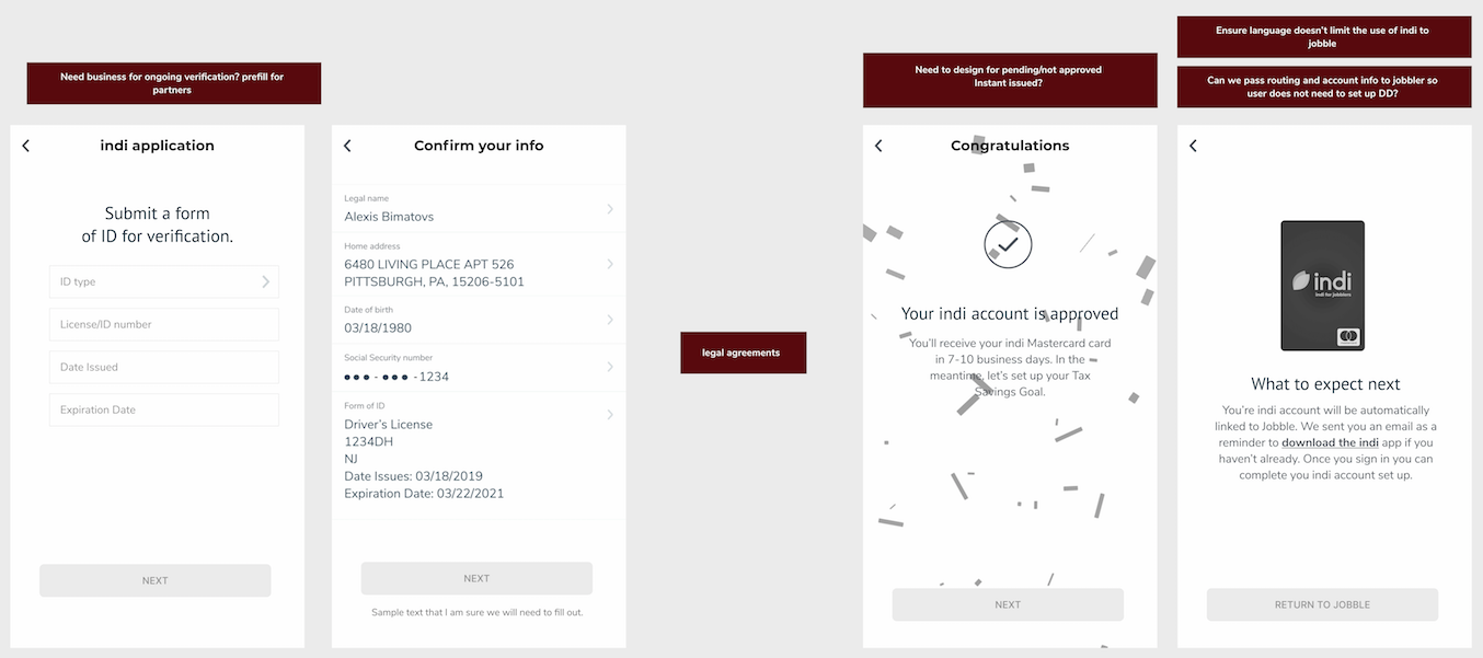
Business partner integration
One major benefit of creating the banking application flow on the web is the opportunity for indi to integrate with business parters. If the user applies through one of indi’s business partners, we’ll have a number of data points pre-filled. While this can expedite the flow, we allow the user to modify any information that was passed to us. To understand the full journey, I documented potential integration points from a partner we are working with.


Wireframes and planning
Some basic wireframes were put together to help facilitate conversations between design, dev, and our product manager. Here we discussed the order in which data would need to be collected based on when the account is created and what the bank requires to open the account. We determined the extent of the integration with business partners in terms of being able to pass the account information back so users do not need to set up direct deposit. We revisited mixpanel data to look at where the current onboarding was succeeding and where it could be improved.