
Disney+ Exploration
This project has no affiliation with Disney+ and was conducted independently as a personal exercise. I built, evolved, and maintained the pattern library for my current role. While I love to practice and preach indi’s design thinking philosophy and visual paradigms, I find it invigorating to step away and explore other systems once in a while. My objective here was to identify, understand, and briefly capture some of the UI building blocks that make the product great. Below is the output from this brief design spike.

About
The goal of this exercise was to explore the Disney+ web application and audit their assets for overall consistency, creativity, and utility.
My process started with a UI audit where I gathered the core permutations of UI elements. From there I built components in Figma based on these patterns.
This exploration was intended to exclude mobile patterns and differences in an effort to keep the scope to a couple hours.
Tools I used during this exercise include Figma and Chrome DevTools.
The result was a mini pattern library that helps showcase a few baseline properties and components., and an understanding of the visual language Disney+ uses.

Takeaways
A few observations and questions I have from this exercise include:
Why is the favicon bright purple, I do not see this used elsewhere in the UI?
Would a secondary typeface, in addition to Avenir, help punch up the UI and add some visual hierarchy.
For the Kid friendly interface, buttons are pill shaped and have gradients. I would be interested in tightening up the two patterns where some properties are better aligned (gradient approach/border-radius) but other properties really set them apart (color).
There are multiple variations of blue and turquoise being used, could some of these permutations be eliminated.
The design patterns are really beautiful and the dark aesthetic empowers the content to speak for itself.
What would a light theme look like?
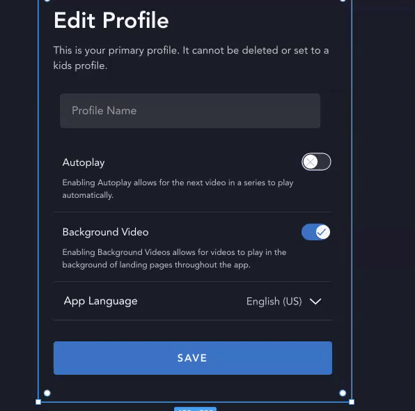
Should you be able to “Edit Profiles” when currently “watching“ from a Kid’s Profile.
Should there be a step-up / security speed bump for a handful of account actions.
I was first unclear on the term “suggested” when looking at any details page, has the term “Similar Suggestions“ or “Similar” been considered?
Some of the confirmations are very subtle, when adding to watchlist just the icon transitions, which is not visible with my curious on top. Additionally when deleting a profile there is little indication that something is happening or was successful.
Would it be useful to add custom Profile Avatars to be able to distinguish profile owners at a glance.
Would it be useful to be able to search character names from the avatar selection view.
Could a share feature encourage engagement, collaboration, and growth.
This GIF shows how easy it is to update and maintain designs when you have your styles systematized. A few obvious items I would dig into next would include:
Cards
Navigation
Spacing
Modals
Font Scale
Additional input styles
Accessibility requirements
The entire mobile app, and more 😃
Standardizing naming conventions for colors, tints, and shades
Animation guidelines
Importance of Systems Design
There are many benefits of having a well captured and tested design system. This is going to make life easier on designers, developers, but most importantly your customers.
Design is only scalable when you have an established language. By investing in a coherent set of guidelines, design, marketing, and development are able to maintain consistency, build faster, and deliver better products. Without a well thought out style guide, it can be difficult to provide a predictable and seamless experience, ultimately creating poor code, design debt, and limiting your ability to attract and retain customers.
